
Four Ingredients for Building a Great Study Abroad Website
At the request of David Taylor, Director of Global Abroad Programs at Wake Forest University’s Center for Global Programs and Studies, in 2014 we took on our first study abroad program site redesign. After almost a decade of higher ed website redesigns of varying scopes, it was particularly rewarding that David and his staff were pleased with the results and allowed us to share them with you.
Since this first project with Wake Forest University, we’ve tested these strategies on three other study abroad sites. The results led to our creation of Study Abroad Pro, a WordPress plugin that makes it possible to get these same results at a fraction of the cost and time of the initial project investment. Wake Forest University is one of the first adopters of the Study Abroad Pro plugin.
Part One: The Assessment
Wake Forest’s Study Abroad Program Challenges
They were doing fine. WFU had recently been recognized as a flagship program, according to the IIE (Institute of International Education, publishers of Open Doors). In fact, they ranked #3 in the nation, meaning they had the third highest percentage of students who study abroad before graduation.
While Wake Forest University was already ahead of the competition, they weren’t satisfied. They wanted help as they raised the bar even higher.
On a typical year, between 60-65% of the WFU student population studied abroad, but they had set a goal of 70% participation. During our discovery process, we uncovered four significant challenges that appear to be common for study abroad program sites across the board. These are the challenges we addressed in the initial project and carried over into the development of the Study Abroad Pro plugin.
1. WFU’s Study Abroad Website Needed a Facelift
Since a large percentage of study abroad programs use the same software (Terra Dotta is the parent company of the old StudioAbroad software, now TDS for Study Abroad), many study abroad program sites look similar. WFU wanted their site to shine, and that required changes to the design and an assessment of their use of images.
2. WFU’s Site Appealed to a Very Specific Student Profile
They were quite successful with certain segments of their student population, but they realized they had an untapped student demographic in STEM (Science, Technology, Engineering and Mathematics majors) students. If they wanted to meet their new goal, they were going to have to figure out how to reach those students.
3. Their Recruitment Funnel Wasn’t as Effective as It Could Be
Older designs don’t incorporate new lessons. Depending on when your site was designed and who designed it, it may or may not have a clear-cut recruitment funnel in place. See if yours is effective by posing the following questions:
- Once students find your site, is there any obvious way for them to engage with you?
- Is it easy to find essential information?
- What does your site do to convince students that they can afford to study abroad, and that they must study abroad?
- Once students are persuaded, is it easy for them to apply or sign up for more information?
Site designers have learned a lot in the past decade about how important navigation and calls to action are. That’s why older .EDU sites typically don’t deliver results as well as sites that have been redesigned by recruitment experts who have experience in the higher education industry.
4. WFU Didn’t Have Concrete Analytics Tools in Place
In the 15 years that I’ve been working with higher education sites, I’ve repeatedly come across people who either didn’t have access to the analytics of their site performance or who only had access to confusing and practically unusable reports. They often don’t know where their site traffic is coming from (Mobile phones? Tablets? Organic searches? Paid search?) or how effective their web pages are (or are not) in capturing student interest.
Good analytics reports are invaluable. With accurate measurements, you can determine what is working and what isn’t. This empowers you to make decisions that will get results.
Part Two: Solutions
Three Goals Your Site Can Accomplish
As we worked with Wake Forest University’s Study Abroad program website, we developed solutions that not only solved the problems mentioned above but also enhanced the user experience overall.
Our client was happy. He said, “Our Summer and Fall applications are up—and I think the new site has played a contributing role. Also, we continue to receive great feedback on the new design from both internal and external sources.”
As you examine your site, you may decide you want to address these same issues.
1. Sites Look the Same? Make the Site Stand Out
Travel brochures are never dull; likewise study abroad sites need to inspire through vibrant visuals. A Temple University study evaluating the role of images on tourism websites found that inspiration-related elements had the greatest impact on first-impression formation. Our experience with higher education sites coincides with the study’s conclusion that visually appealing images get attention and motivate people to explore your site.
Scroll down to see how we utilized this concept for Wake Forest University’s program site redesign.
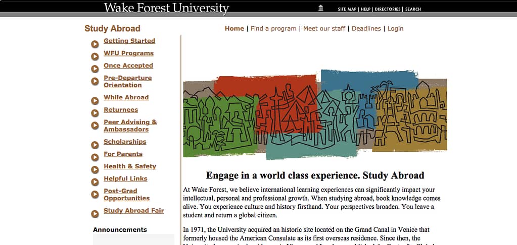
WFU Center for Global Programs and Studies Site: Before Site Revision
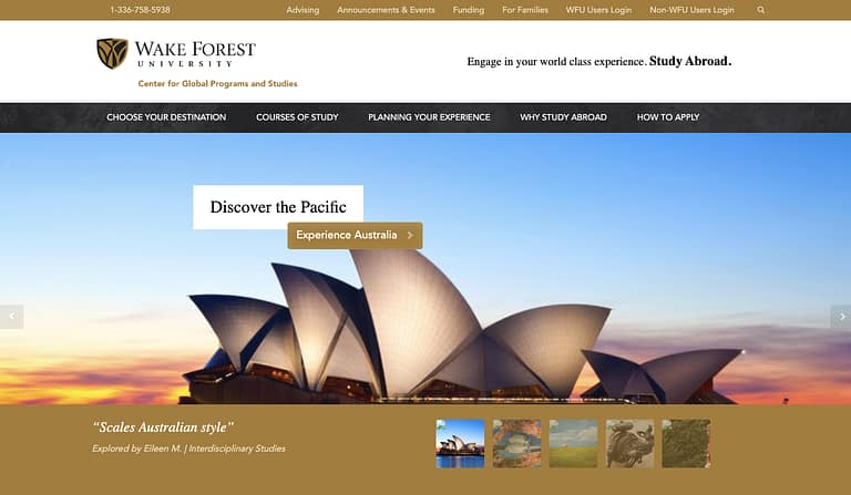
WFU Center for Global Programs and Studies Program Site: After Site Revision

The home page now hosts a slider featuring vivid pictures of fascinating destinations. We intentionally filled the site with images that make people want to travel and explore.

Wake Forest University was quite pleased with the new visuals. When we asked David to rate the aesthetics of the site (on a scale of 1 to 5), David replied, “The site redesign has been a quantum leap forward. It’s a five… We’ve gotten a fantastic response from our users. Obviously, we’d been with the former look and feel of the website since ’05 or ’06. We were in big, big need of an overhaul, and Verified was able to bring that to us.”
We also strove to make sure the design was completely different from the typical StudioAbroad/TDS for Study Abroad layout and design. We’re quite proud of the fact that we were able to create a distinctive look for WFU.
“On the back end you can tell from the functionality that we’re StudioAbroad driven, but we really wanted to move away from a look that did not distinguish us,” Taylor said. “Verified Studios was able to do that.”
2. Limited Site Appeal? Target the Right Students
During our initial collaboration sessions with WFU, we learned that one of their primary goals was to inspire STEM students to study abroad. Verified Studios embraced this challenge, considering STEM students specifically as we designed the main pages.
Taylor worked with us to figure out how to reach out to this demographic. Upon review of the changes we accomplished together, Taylor said, “Our previous layout didn’t show as well. It wasn’t as readable or accessible. Now that the ‘Courses of Study’ tab is so readily available, students can easily find programs of interest. For example, they can click ‘Biology’ right from the home page and see all the opportunities for biology students to study abroad.”


You also can overcome this obstacle. First, you’ll need to identify your most significant untapped demographics, and then you’ll want to find effective ways to reach out to them.
3. Not Sticky? Draw Students Into the Recruitment Funnel
We have learned that students need clear paths, limited choices and intuitive navigation. Most higher education sites have complicated navigation systems in place, but studies show that streamlining choices can increase engagement by up to 600%.
That’s why we narrowed down the options to five menu buttons on the top of the home page, simplifying the navigation and making it very easy to find exactly what a student (in any stage of the process) would need.
Then we invite students to engage and enter the recruitment funnel, using social media and email to forge and deepen the connection. Our start-to-finish recruitment funnel guides students from that first spark of interest through to enrollment.

Part Three:
Making These Upgrades Easy and Affordable
I know that upgrading your site can be an intimidating endeavor. You may have reservations or additional questions.
Since the completion of this first project back in 2015, we’ve had the opportunity to upgrade three more study abroad sites. We carefully analyzed results and client feedback, all of which was incorporated into the development of the Study Abroad Pro WordPress plugin.
Wake Forest University is still our client, and today they are one of the first adopters of the Study Abroad Pro WordPress plugin.
1. How Can a Plugin Replace a Web Redesign Project?
A plugin is a piece of software that enables an application—in this case a website—to do something it couldn't do before. When you add a plugin to your website, you instantly have added functionality—this could be the ability to present your content in a new way or the ability to customize the content on your website—without having to pay a software developer to write unique code just for your website, or wait the months it takes to develop it.
The difference in cost is tremendous, and the experience is analogous to many things you purchase in your personal life. For example: let’s say I want to upgrade my dining room because the furnishings are no longer adequate for my growing family. I can pay a carpenter $4,000 to listen to my specifications, find the perfect lumber and then cut, build, stain and polish a new table to my liking. Or I can purchase a new leaf and additional chairs for my existing table from a furniture store for $400 and spend the remaining money on a summer vacation. Buying a plugin for your website is like buying the pre-made dining room furnishings. These days, there simply is no reason to hire a software developer to write custom code when a plugin will do.
The bottom line: A plugin typically costs a fraction of the cost of a custom development project. Investing in a plugin instead of custom code is the best of both worlds—you can take the vacation and buy the furniture, too.
2. What Exactly Does the Study Abroad Pro Plugin Do?
In a nutshell, the plugin does the following:
- Uses your Terra Dotta data to create a stunning front end for your study abroad programs that stands out from the competition
- Improves digital marketing capabilities (ads, SEO, conversions)
- Enhances your user experience with powerful search features
- Automates syncing between your site and Terra Dotta so changes you make show up consistently
- Adopts the brand and style standards from your website so that your brand is perfectly represented
3. Maintenance
Another benefit of a plugin versus a website redesign? Maintenance is part of the deal. As technical changes happen, the plugin is updated. No need to hire a contractor to go back in and make changes and upgrades. You simply pay the fixed annual license fee and the maintenance is provided for you.
What’s Next?
Update Your Site and Stay in the Game
Now that you know what a Study Abroad program site should accomplish to remain competitive, you may be ready to learn more about specific strategies.
If you’re interested in discussing practical applications of the points mentioned here, contact us for a conversation about your website. We’d be happy to provide you with a no-strings-attached evaluation of your site, including suggestions for ways to overcome obstacles.
Thank you for your time and attention. I truly hope these resources prove useful to you, and I wish you great success with your study abroad program website.
Helpfully yours,
Adam Schultz
Founder & CEO, Verified Studios and Invisible Us
About Wake Forest University
To enhance and bring optimal practicality to this white paper, we interviewed David F. Taylor, Director of Global Abroad Programs at Wake Forest University’s Center for Global Programs and Studies and our lead contact during the site revision project. David was kind enough to contribute his thoughts to our report, and for this we offer much sincere gratitude.

